
UNiversity Of Phoenix
I developed an illustration/icon style, and a social content style guide for the University of Phoenix. The client’s main goals were to bring more consistency to the social posts and to have a more elevated look created. I worked with a team of creatives for about a month to help achieve this goal, the client has been happy with the results so far.
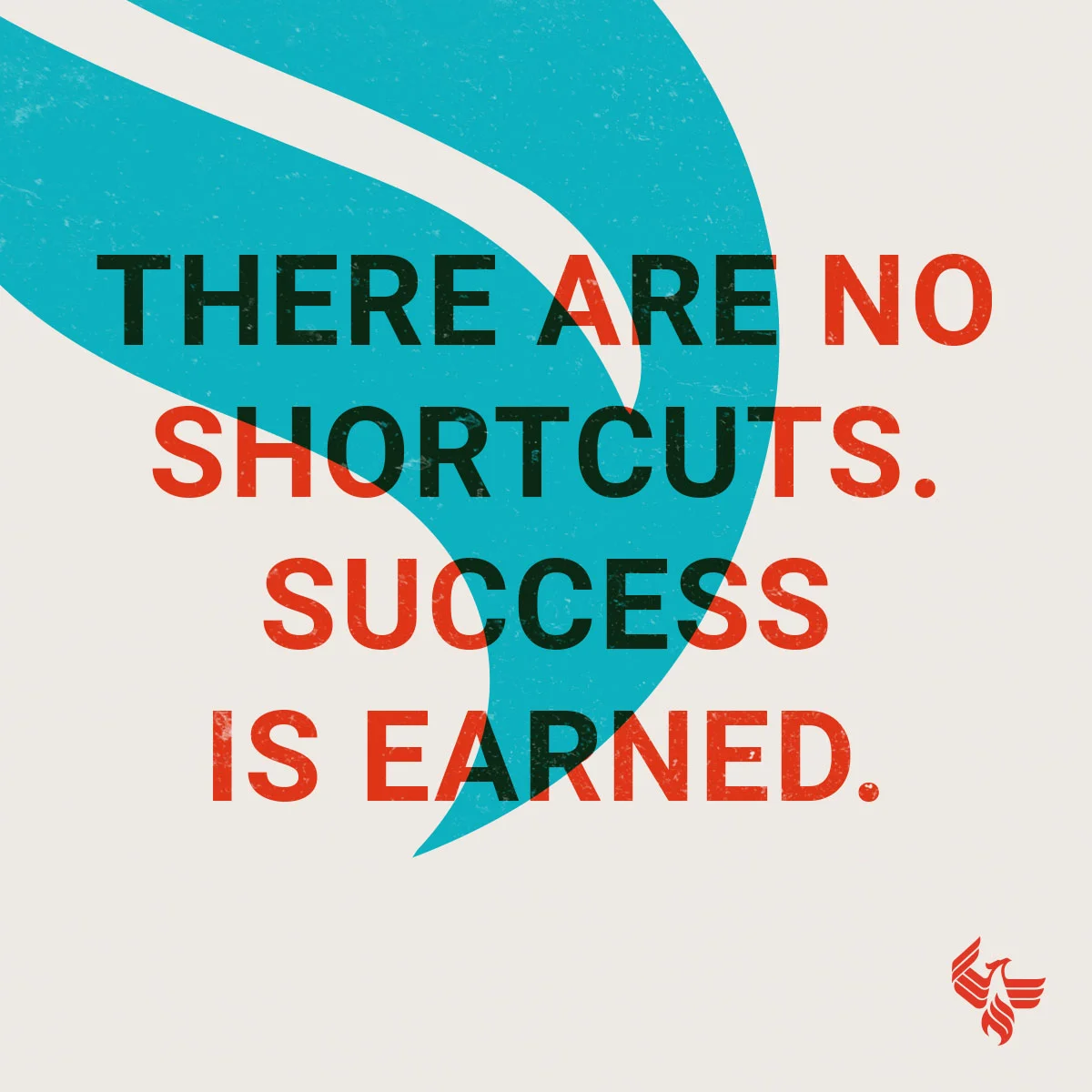
Study Grams
Study grams are a collection of social posts they share every 1-2 weeks that aim to encourage their students to keep working hard.
Round one
Round Two
Round Three - Final


Developing the Illustration style
I researched, designed, and developed an illustration style. I created an evolving style guide deck that aims to help get all artists on the same page for the client.

Exploration
I started to explore the illustration style first. The first thing I did was to dissect the client’s logo, I found that it was made up of varying perfect circles and sharp edges. I kept the logo in mind while I developed the style. I wanted the illustrations to feel like they came from the brand.
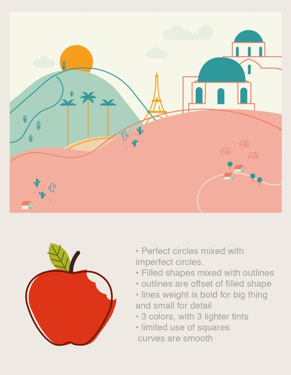
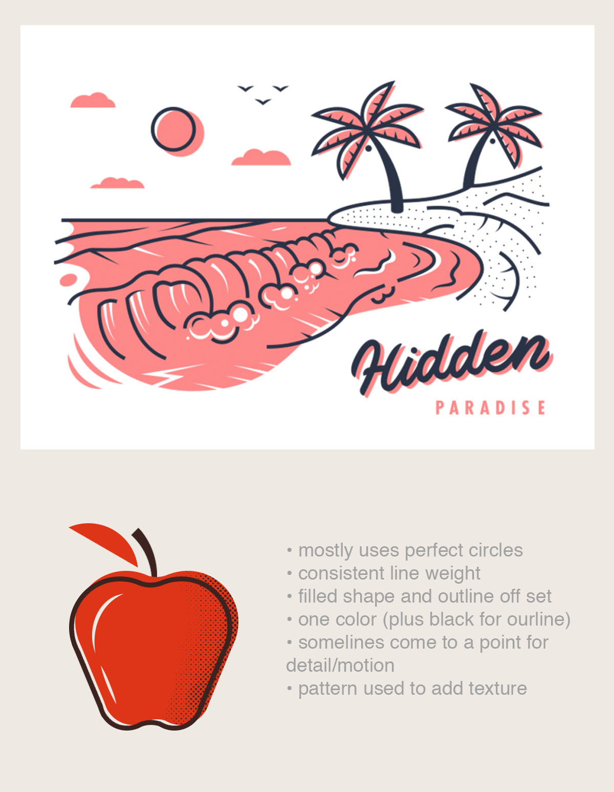
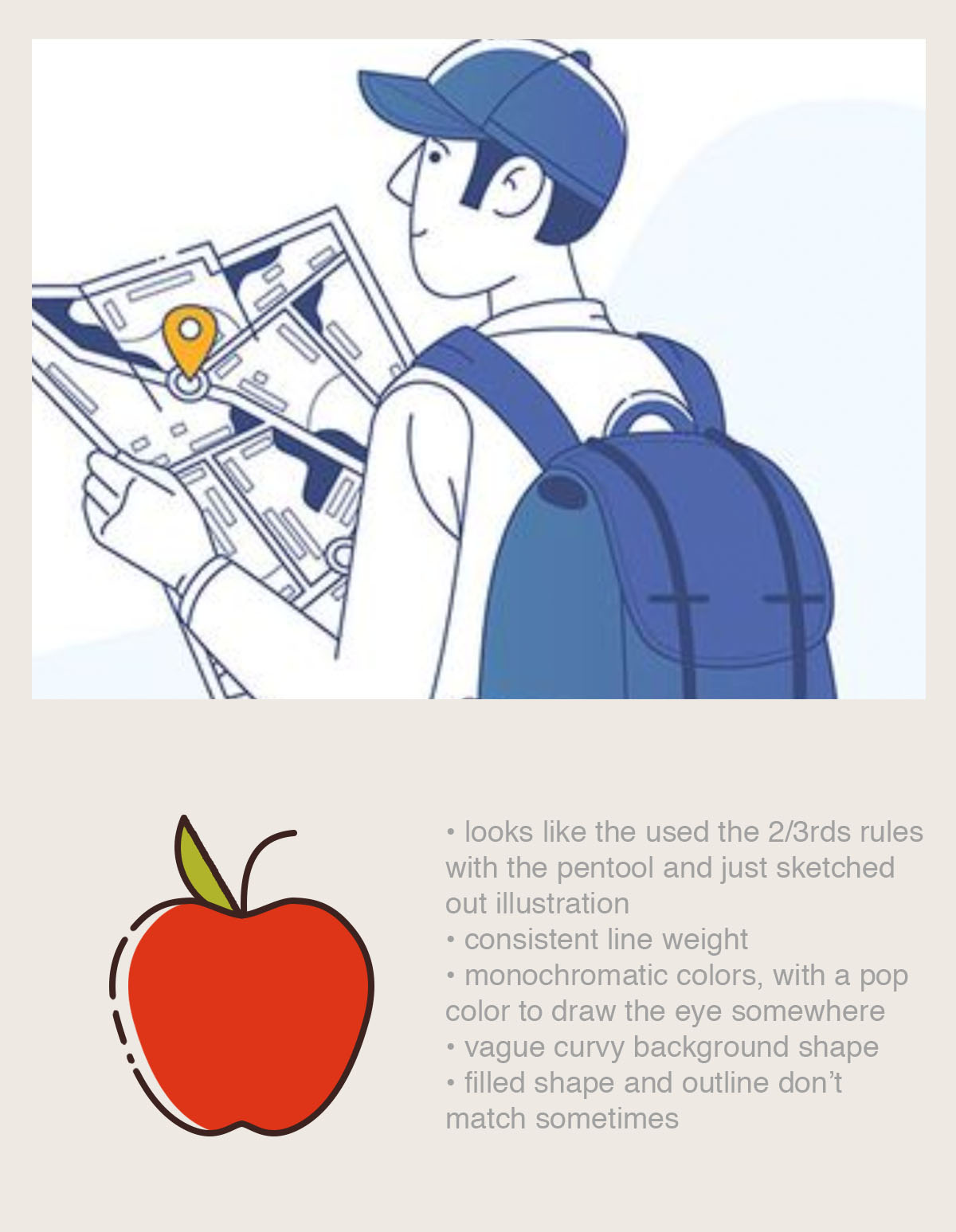
Another designer I worked with did a great design audit of the current brand’s social content. She took concepts that the client was already using and found some design inspirations from Dribblbe and Pinterest that felt more elevated. I took her design audit and created a quick test to see what elements from the inspirations were working, and why. When I would analyze inspirations I would ask myself a series of questions: What shapes do they use to build? what kinds of line weights did they use? How many colors? Did they use any textures? Whats their logic with the amount of detail they used?
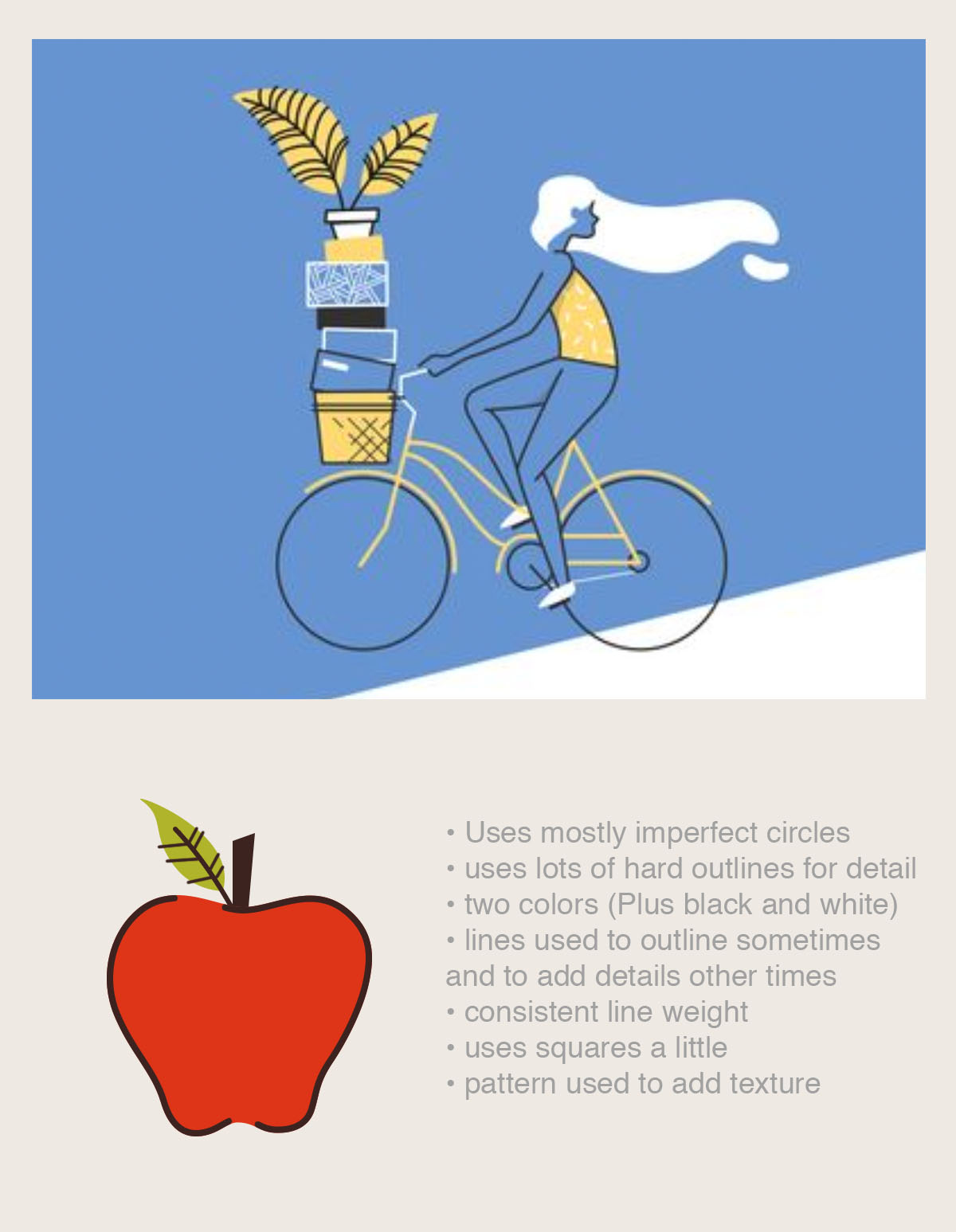
I put the answers to all of those questions in a list and used that as my quick guidelines. I tested the guidelines by drawing an apple in each of the different styles, but I also used the clients branding as well. I reviewed my results with the team and we found that the style of the man with the map fit the branding best. I tweaked the style to reflect the logo a bit better, I used only perfect circles and straight edges.
I started to consider the logo again. I estimated that the logo was built up of about 90% rounded shapes, and 10% sharp edges, this would be my guide throughout all of my illustrations and icons.
Artists featured for inspiration:
Carly Berry, Dmytro Novitskyi, Meg Robichaud, Alex Spenser,

Round two of Development
After we had a basic set of guidelines, I started to experiment with the illustration style some more. Other requirements for the illustration style was it needed to be recreated by another artist while also staying consistent, and it needed to not take a lot of time to create. I created the above illustration about about 2 hours, from sketch to finished product.
To see the completed illustration and icon style guide, click the button below.
Social content
While creating the illustration guide I also worked with another designer to create a social content guide. These two guides worked together to try to bring more consistency.

Original Post
Colors are dull, illustration style is inconsistent, Font isn’t apart of the branding guidelines, Logo lockup is always in a new place on each post.

Updated Post
Uses branding colors and fonts, illustrations follow the style guide, logo is locked up.

After creating and recreating a few posts we tested to see if our new guide would fit better with the client’s current feed. The result feels more on brand, consistent, and clean.